

One of the great things about Showit is the creative freedom you have in customizing your mobile and desktop design independently. While this is one of Showit’s greatest assets above other drag and drop website builders, it also leads to come confusion and sometimes even frustration.
If you’re new to Showit and have found it difficult to understand the relationship between what happens on mobile vs desktop as you are designing, this blog post is for you!
I see some variation of this question quite a bit: “How come when I do X on desktop it does/doesn’t do X on mobile?”
So today we are pulling back the curtains on the mystery of mobile vs desktop design in Showit!
An Overview of Desktop Vs Mobile Design in Showit
One of the most important things to understand is that the ability to customize your desktop and mobile designs independently lies within the design and placement of an asset, not with the existence of the element itself.
What does that mean? This means that if you add an element to the page, that element will appear on both mobile and desktop versions. The existence of the element itself is shared between both sides.
But, once you have added the element, you have full creative control over what that element looks like and where it is placed independently on desktop and mobile. Here is a short video demonstrating this concept.
Adding a Design Asset to Only Desktop or Mobile
Now we wouldn’t be able to call it full creative control if you were stuck with all of the same elements on both mobile and desktop, now could we?
So let’s say you have an element that looks great on the desktop version, but you’d rather just get rid of it altogether on mobile.
Don’t try to delete the element from the mobile side! As demonstrated above, you should now understand that doing so would delete the element altogether.
Instead, Showit gives you the ability to hide elements on desktop or mobile as you see fit. Here’s another quick video showing how to do that.
Best Practices for Designing the Mobile Side of Your Showit Site
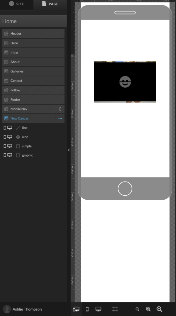
When first jumping into a new design, it’s easy to forget just how much independent creative control you have over the mobile version of your website. So it’s not uncommon to jump in and build out some of or even an entire desktop design and see something like this on mobile: 😳
I have personally done this to myself more times than I can count. It’s not fun to say the least, and many times can leave someone so overwhelmed they don’t even want to touch it.

So over the years I’ve learned a few best practices to help keep your sanity and enjoy the creative independence, rather than see it as annoying double work.
Always use the side-by-side view when designing
This allows you to tweak both sides as you go, leading to less adjustments when it comes to fine tuning the rest of your mobile design. That doesn’t mean you have to make it perfect simultaneously (in fact I usually don’t and I’ll explain why later) but if you at least take care to assign the correct colors, font types, etc. it will make your life so much easier when it comes time to finish up the mobile design.
Take it canvas by canvas, not page by page
Another best practice is to develop the mobile version of your website as you finish each canvas on desktop. A lot of the times people will fully build out the desktop without touching the mobile version, leading to an overwhelming conglomeration to fix before you can launch your site.
If you remember to design out your mobile version canvas by canvas instead of page by page, it will feel like a lot less work.
Having such complete creative freedom is great, but it can also be seen as extra or double work because you have to manually build out both versions. But keep in mind that this feature is also one that makes Showit so great.
Personally, I would rather do the extra work to make sure my mobile version looks just as amazing as on desktop vs leaving it to chance with other platforms’ auto optimizations, which many times don’t come out looking the way you would want them to!
Don’t fine tune the mobile version until the desktop version is complete
I recommend using a combination of each of these practices. When designing a canvas on the desktop version, take care to make small tweaks along the way on mobile, but wait until you have finalized the desktop version fully and then design your mobile to match.
If you try to fully design desktop and mobile simultaneously, you inevitably end up with more work in the end because everytime you make a major change on desktop, you have to change it on mobile as well.
I can sometimes go through 5-10 different iterations of a canvas on the desktop version before I am fully happy with it. If I tried to design both sides simultaneously, I would have to completely redo both versions every time. By keeping the tweaks to mobile minimal while I am solidifying the desktop version, I give myself a solid roadmap to guide my mobile design.
What if I’ve Already Designed My Desktop Version and Now Have a Mess on the Mobile Side?
Let’s say the damage is already done. You’ve painstakingly spent all this time perfecting your desktop site and your anxious to get launched but then realize you’ve neglected the mobile design along the way.
No you have an entire page, or maybe even an entire site to basically start over and design again on the mobile version.
Yup. Been there. Done that. Got the t-shirt.
While it’s impossible to avoid the inevitability of having to design your mobile version, there are some tools and tricks to make it easier for you.
Work with Wolf & Willow
First, what kind of friend would I be if I didn’t mention that we offer support for Showit development?
We’ve got a great Designer for a Day service that is perfect for taking care of things like this. We’ll spend an entire day (or half day) entirely dedicated to checking off your entire Showit to-do list.
If you’re ready to offload the mobile design of your website (or anything to do with your website) send us a note. We’d love to help!
Mobile layout tool in Showit
Many people miss this feature or know about it and misunderstand it.
Showit has a Mobile Layout Tool that allows you to quickly format the mobile canvas to match the desktop version. Disclaimer: it’s not perfect. It’s not going to magically put the canvas into a fully optimized mobile design.
But what it does do is give you a better starting point. There’s a whole range of options which you can find detailed explanations for in one of their help docs.
You can choose the option that gets you closest to where you want it to be, and then finish customizing it from there. What I find is that it’s a tremendous help in resizing, adjusting colors, etc. so I am not starting completely from scratch.
Now You Understand Mobile vs Desktop Design in Showit!
I hope this was helpful for understanding the differences between designing your desktop and mobile versions of your website in Showit.
Got any questions? Send us a DM!


